


Three Pillars of Scientific Data Communication in Biotech
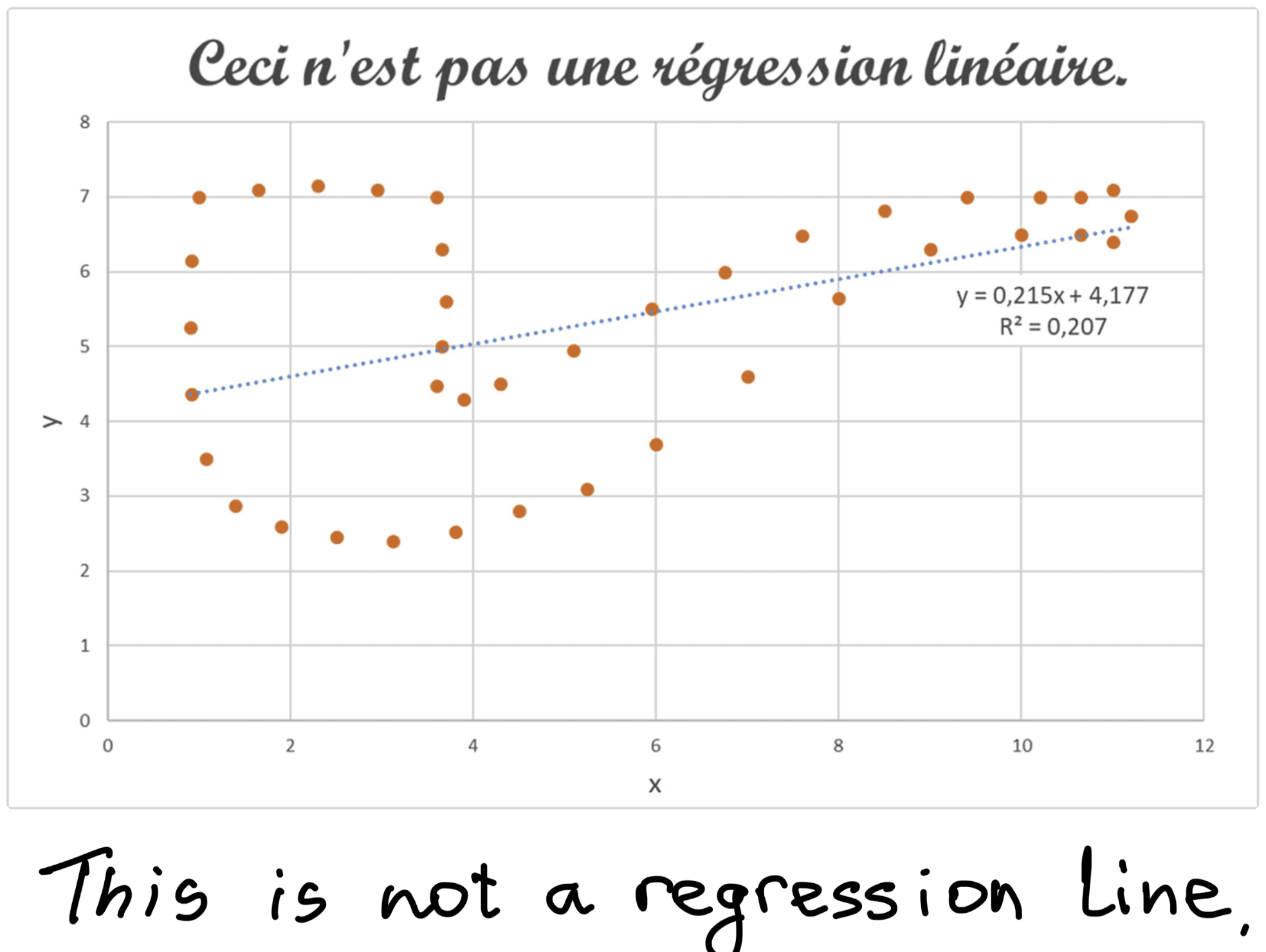
Figure 1. Graphical abstract from Tedoldi et al., 2025, depicting a regression fit into a dotted outline of a pipe. With the title “This is not a regression line”, the abstract is alluding to René Magritte’s painting “This Is Not a Pipe”.
Pillar #1: Integrity
Behind every graph is a body of academic or commercial scientific research. Honest and accurate communication of this research is essential to ensure patient safety in the therapeutic R&D. If we allow misunderstanding of this research, lack of academic rigor, or even just rushed sloppiness to creep in, we risk harming patients. In this section, we do not focus on deliberate fraud, which is the terrain of ethics stewards like Retraction Watch and Elizabeth Bik. The more inconspicuous threat is unintentional misrepresentation: a misplaced regression line, unnecessary extrapolation, comparing apples to oranges, implying correlation as causation, and so on.
Returning to the topic of
Logically, we should not be comparing (1) the pandemic that has only begun with seasonal flu that is tackled each year by global vaccinations, and (2) geographically widespread versus localized outbreaks. We also should not rely only on fatality rates, because there are other factors, such as transmission speed, healthcare system burden and disparities in access to care, access to vaccines, and so on. Finally, pie chart usage is also not the best solution, because it is hard to grasp how different the areas of the charts are. More on that later in this blog post (Figures 2, 3).

Figure 2. Comparative pie charts illustrating the fatality rates of
Commercial drug development and other biotech fields are environments with rapidly shifting priorities where rushed data work can lead to serious consequences downstream. Data scientists and computational biologists often work under pressure, facing shifting gears and deadlines. When work is in a state of emergency, it is easy for oversights to slip through. Furthermore, misrepresented data may move between teams or up the chain of communications, thus small errors can quickly snowball. The most serious consequence arises when flawed visualizations influence regulatory submissions, clinical trials, and, ultimately, patient outcomes.
The following list of recommendations can help you and your teams improve scientific rigor and data integrity:
- Standardize data flows. Implement standard operating procedures (SOPs), electronic lab notebooks (ELNs), and consistent data management practices across all teams. It sounds obvious, but you may be surprised how many times this basic practice is skipped with dire consequences.
- Ensure code control. Use tools like Jupyter Notebooks and GitHub to document, version, and share analyses. Analyses of clinical studies should be auditable and accessible within required regulatory timelines on short notice. While full research reproducibility is rarely attainable, it must remain a guiding principle of scientific informatics.
- Foster a culture of openness. In the long run, research groups and large companies thrive when team leads actively encourage questions, transparency, and constructive critique. A psychologically safe environment empowers scientists to surface concerns before they become problems.
- Prioritize scientific rigor over speed. Most errors happen when teams are rushed or overworked. Resist the urge to cut corners. Accuracy, reproducibility, and integrity should always take precedence in scientific work.

Figure 3. Examples of data visualizations, broadly based on Cairo, A. (2019). How charts lie: getting smarter about visual information (W.W. Norton & Company) and Tufte, E. R. (2001). The Visual Display of Quantitative Information (Graphics Press).
Top Row:
Example
- On a pie chart like this, it is very hard to perceive the areas taken by categories, and it is hard to compare elements (like categories B and C).
Example
- Here, sorting helps to compare the bars, and now we know that B>C, but colors do not actually code any information.
Example
- Here, nothing is highlighted, and color coding is absent. While in a scientific paper this figure would work great, on a slide or in a data story/dashboard, it would not, because the take-home message of this figure is not clear. If a presenter has only a few seconds to show this graph, the audience may be lost.
Bottom Row:
Example
- In this figure, colors code for the two categories that we want to draw the audience’s attention to. Let’s say these are B and C. In addition to that, numbers above bars are included to demonstrate the minute difference between B and C.
Example
- The same figure as in (4) was converted to grayscale to make sure that shades code the information. That way, we verify that the take-home message is perceivable without relying on color.
Example
Pillar #2: Clarity / Effectiveness
Take a moment to think carefully about your audience. Unlike a purely academic crowd at a university seminar or a conference, a biotech audience tends to be more diverse in terms of specialties. The audience usually includes bioinformaticians, statisticians, molecular biologists, business development folks, marketing people, and others. When you present at large corporate meetings, like “All Hands”, “Town Hall”, etc, you speak to all of them. Presenting at meetings with clinicians or specialists outside of your field of expertise is another example. Communicating well across those different stakeholders takes skill and care. It requires the ability to step outside of your own mental framework, imagine someone else's background, and think about how they may interpret the presented information.
One of the oversights we notice is presenters showing lots of information as a demonstration of effort and knowledge. Particularly, it is common to see in data-heavy settings with presenters inexperienced in science communication. It is tempting to showcase how much work has gone into an analysis: multiple plots, long lists of methods, dense slides full of niche abbreviations and terms. However, when everything is shown at once, the key message gets buried, leaving the audience confused and missing the opportunity for real engagement. When we present jargon-heavy work or convoluted visuals, it can appear as though we are discouraging engagement and withdrawing from interactions. In other words, we are guarding knowledge instead of sharing it.
Clarity is not oversimplification. Rather, it involves the ability to step into your audience’s shoes, which is a sign of respect for your colleagues’ time and attention. When your audience understands your work, they can ask critical questions and reveal gaps or offer new angles you may not have seen. Healthy scrutiny that comes with clarity facilitates scientific growth, especially when it comes from a place of genuine understanding. Removing information wisely is not “dumbing down” your science; it is making it visible, legible, and accessible to others who bring different expertise to the table.
- Choose the right format and amount of information. A table may work better than a cluttered graph, for example, when precise numbers are important. A clean diagram may work better than a block of text, for example, for the “at a glance” effect. Compare examples 1 and 2 in Figure 3. Based only on example 1, can you distinguish definitively which category is larger: B or C?
- Ask yourself: what is the most important take-home message from your figure or slide? That message serves great as a title. Do not leave it up to chance or assume your audience will draw the right conclusion quickly. Spell out the main result so that your reader or viewer immediately grasps the point. In example 4 in Figure 3, the take-home message is coded by only two colors. The figure can be simplified even further by using the same color for both B and C categories.
- Once you have identified the main takeaway, strip the figure down to only what supports that message. Remove information that does not support your point or is unclear to the audience. Remove extra labels, colors, redundant panels, and decorative elements. Avoid chartjunk, such as 3D effects, shades, reflections, and other elements that do not code information. Compare examples
2-6 in Figure 3. Are all the colors in example 2 really necessary?
The data can ultimately be displayed in various formats, and the charts in Figure 3 aim to only demonstrate how readability may vary based on the presentation method. The crucial element of scientific clarity, however, is that it cannot compensate for the constraints of poor-quality data. In a perfect situation, data should speak for itself.
Pillar #3: Accessibility
Processing of information and engagement with it rely on sensory and functional features of our bodies: vision, hearing, speech, mobility, and cognition. Because audiences are diverse in how they perceive and process information, presenters should make sure their messages are accessible to all. Adopting inclusive design principles could become an element of your company’s culture rather than a one-time fix.
- Color blindness. Because color alone may not be enough to make your figure readable, you could use varying visual properties (Duke et al., 2015). For example, shapes and shades add a coding property in addition to colors. Most scientific figures have only one or two colors, and in this case, shade can distinguish information. If using more than two colors, you can use online resources to simulate color deficiency to see how your visualization looks to people with color blindness. For designers and programmers there are readily accessible colorblind-friendly palettes (here is one from IBM and from R ggplot2). Take a look at examples 4 and 5 in Figure 3, where example 5 is a black and white version of example 4.
- Blindness and low vision. Provide full captions of the figures and visuals. Powerful technologies like text-to-speech can make figure information accessible. Explain your visuals in captions and annotation layers. The caption of Figure 3 is an example of spelled out figure descriptions.
- Hearing disabilities. Captions, as in the case above, help here as well. Ensure your mouth is visible when you are talking to the audience because it allows for lip reading. Maintain a natural speaking pace.
- Cognitive abilities. Avoid flashing lights and rapid transitions so as not to provoke uncomfortable neurological reactions or cause confusion. Cluttered slides may also become an issue. It is difficult to read them not only because there is a lot of information, but also because people process information at different pace. Simplifying your slides and adapting your delivery makes sure that everyone can follow along safely.
Conclusion
Good data communication should do more than just appear tidy or appealing. It should also assist users in comprehending the facts and science. Good data practices are essential for making this happen. Accuracy is especially important in healthcare and life sciences, where the way information is presented can influence behavior, shape policy decisions, and affect how stakeholders perceive the issues.
At Quantori, we are experienced in data visualization and have teams of expert scientific communicators helping our clients with their data communication needs. With the support of our expert software developers and engineers, we create custom solutions, such as visualization dashboards, to bring insights from our clients’ data. Learn more about our case studies here or reach out to us at contact@quantori.com.